
Color experiment - All natural
- u19213736
- Apr 16, 2021
- 6 min read
Updated: Jul 8, 2021
Mixing tea with natural products to create beautiful colors


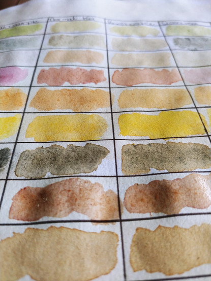


For this project, I have decided that I want to try to use only natural products to color my tea. In this experiment, I have 6 columns.
This is where I wrote down the name of the product that I used. Sometimes the colors can start to really look similar, so it is a good idea to label each one.
This is where I made a sample of the original color. I included these samples so that I can compare what the mixed samples look like compared to the pure color sample.
This is where I mixed the different pigments with Glen Tea to see the results.
This is where I mixed the different pigments with Rooibos Tea to see the results.
This is where I mixed the different pigments with Green Tea to see the results.
This is the last column that I created with notes that I made while I was busy with the experiment.
For this project, I have used 9 different pigments. I had to use various methods to be able to extract the pigments from the products. Some of the products released a lot of pigment while others only produced a dull color.
Spinach
To get the green hue that I wanted I decided to soak the leaves in boiling water for about 20 minutes. I then used my mortar and pestle to ground leaves down to a paste. While the pigment that the leaves produced was not very vibrant, it was definitely green. but what I noticed when I mixed the green paste with the tea, the color turned a brownish color. Even when using Green tea (which has a natural green undertone). I thus came to the conclusion that the pigment that was produced from the leaves is not strong enough to use in combination with the tea, but should rather be used in its purest form.
Blue flower
I was rather disappointed with the results of this color. I started by soaking the blue flower petals in boiling water for also about 20 min. I used my mortar and pestle to grind the petals down into a paste. It was a lot more liquidy in texture than the green paste. The paste from the flowers produced a beautiful cornflower blue pigment. But once I put the pigment onto paper it turned to a dark greyish color. When mixed with the different teas, only the green tea did not fade totally to brown. I will definitely have to rethink what I can use to create a more vibrant blue to use in my paintings.
Sweet red wine
What a disaster... I am not a big drinker so when I took out this bottle of wine a friend gave me for my birthday I thought it would be perfect to experiment with. I was wrong... What I did not know was that although this is a red wine, it did not have a strong color because it was a sweeter wine that was closer to Rose type of wine, Imagine my disappointment when I started to put this color on the paper and it practically disappeared. I have now made a mental note to go and purchase another red wine so that I can hopefully get a better result. When I mixed the wine with the tea, it did not really have any significant effect (as to be expected).
Beetroot
I have to say that this was by far my favorite product to use because it has a very strong and vibrant pigment. For this product, I did cheat a little bit. I used a jar of my grandmother's already sliced and diced beetroot. I only used the juices of the beetroot. I was very impressed with the color combination of the beetroot and the Rooibos tee. I am definitely going to use this pigment in my project. It gives you the perfect fuchsia pink color.
Smoked paprika
When I did this experiment, I was rather surprised at the outcome of the color. What I had expected was a bright or even deep red color. But it came out a more vibrant orange, almost a burnt orange. I put a small amount of the smoked paprika in a white ceramic bowl. I then poured in a few drops of boiling water and let it sit and steep for a few minutes. I feel that when I mixed it with the different teas, it did not create a variation in the color itself. I would have liked to achieve different shades of orange perhaps.
Turmeric
To achieve this vibrant and bright yellow I used turmeric spice. I was very impressed with the result and I am definitely going to be using this spice in my artworks. To get this powder to a liquid form I followed the same process as with the smoked paprika. I used a white ceramic bowl and let the mixture steep for a few minutes before I made my samples. This is definitely a winner compared with some of the other products I have used so far.
Charcoal
While busy with this experiment I came to the realization that traditional mandalas have really distinct outlines. I started to brainstorm about what I could use to create a black pigment. I decided to grind down some charcoal. I mixed this powder with some water until it formed a liquid paste which I then mixed with the different teas. Initially, when wet, the black was very rich and dark but as a few minutes passed it to turned to a more dark greyish color. When mixed with the teas the color changed to a more brownish color which would work ideal for paintings bricks or nature scenes. What I soon discovered after the pigment had dried is that it smudged a lot. This will not work for the project that I am working on as I need precise crisp solid black lines.
Iris Roots
While on my quest to create a black pigment, I stumbled across an article that stated that if you boil the roots of an Iris plant then it will create this black pigment that was normally used to die fabrics. I went foraging in the garden and found some Irises from which I took a small piece of the roots. I boiled this piece of root for about 20 min and the water had only changed to very light pink. After about an hour of boiling, I came to the conclusion that this root is not going to turn my water black. It did however create a beautiful dark purple. Which of course did not translate onto paper. The color that I ended up with was this very deep reddish-brown color. When I mixed it with the tea, it really brought out the warmer tones. Although this is not what I was going for, I am very impressed with the color at then. But the long process that I needed to go through to achieve this result might not be worth it in the end. This is still an ongoing debate.
Instant coffee
The last color that I created was using normal instant Frisco coffee. I included the coffee color in this experiment to be able to compare the intensity of the colors between coffee and tea. For this process, I put some coffee into a cup and added some boiling water. I let this mixture steep for a few minutes, I started painting my samples. The tea did not really have an effect on the color of the coffee. I chose to include coffee in this experiment to juxtapose it with tea. While tea has many calming qualities, and for me personally it is a great way to start my day, it does contain a small quantity of caffeine. Studies have found that if you drink too much coffee in your daily routine, you could be self-sabotaging your anxiety. It might be one of the reasons why you are having constant and reoccurring anxiety attacks. In this project, I want to show how the things we consume directly affect our mental and physical health. But the majority of my project will be painted using tea, with only accents of coffee here and there.
This was a very interesting experiment for me. I went into it thinking I knew exactly what the outcomes were going to be, but I was pleasantly surprised some of these products I will be using in my artworks and some will not leave this page.
I was however disappointed to see that after a few weeks the colors did seem to fade a bit and were not as vibrant and bright as when they initially dried. This could pose a problem and I will have to see what other mediums or materials I can use to enhance the colors a bit. But the aim of this project is to use as many natural products as possible.


Comments